You might remember in a couple of earlier posts (here and here) I discussed the Royal Statistical Society’s ‘Statistic of the Year’ competition. I don’t have updates on the results of that competition for 2018 yet, but in the meantime I thought I’d do my own version, but with a twist: the worst use of Statistics in 2018.
To be honest, I only just had the idea to do this, so I haven’t been building up a catalogue of options throughout the year. Rather, I just came across an automatic winner in my twitter feed this week.
So, before announcing the winner, let’s take a look at the following graph:
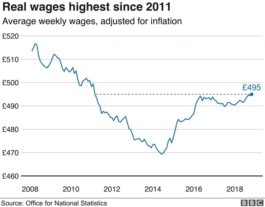
This graph is produced by the Office for National Statistics, which is the UK government’s own statistical agency, and shows the change in average weekly wages in the UK, after allowance for inflation effects, for the period 2008-2018.
There are several salient points that one might draw from this graph:
- Following the financial crash in 2008, wages declined steadily over a 6-year period to 2014, where they bottomed-out at around 10% lower than pre-crash levels.
- The election of a Conservative/Lib Dem coalition government in 2010 didn’t have any immediate impact on the decline of wage levels. Arguably the policy of intense austerity may simply have exacerbated the problem.
- Things started to pick up during 2014, most likely due to the effects of Quantitative Easing and other efforts to stimulate the economy by the Bank of England in the period after the crash.
- Something sudden happened in 2016 which seems to have choked-off the recovery in wage levels. (If only there was a simple explanation for what that might be.)
- Wages are currently at the same level as they were 7 years ago in 2011, and significantly lower than they were immediately following the financial crash in 2008.
So that’s my take on things. Possibly there are different interpretations that are equally valid and plausible. I struggle, however, to accept the following interpretation, to which I am awarding the 2018 worst use of Statistics award:
ONS data showing real wages rising at fastest rate in 10 years… is good news for working Britain
Now, believe me, I’ve looked very hard at the graph to try to find a way in which this statement provides a reasonable interpretation of it, but I simply can’t. You might argue that wages grew at the fastest rate in a decade during 2015, but only then because wages had performed so miserably in the preceding years. But any reasonable interpretation of the graph suggests current wages have flatlined since 2016, and it’s simply misleading to suggest that wages are currently rising at the fastest rate in 10 years.
So, my 2018 award for the worst use of Statistics goes to…
… Dominic Raab, who until his recent resignation was the Secretary of State responsible for the United Kingdom’s withdrawal from the European Union (i.e. Brexit) and is a leading contender to replace Theresa May as the next leader of the Conservative Party.
Well done Dominic. Whether due to mendacity or ignorance, you are a truly worthy winner.
https://twitter.com/DominicRaab/status/1072744754096549888