Here’s a question: how do you get dogs to walk on water?
Turns out there’s a really simple answer – just heat the atmosphere up by burning fossil fuels so much that the Greenland ice sheets melt.
The remarkable picture above was taken by a member of the Centre for Ocean and Ice at the Danish Meteorological Institute. Their pre-summer retrieval of research equipment is normally a sledge ride across a frozen winter wasteland; this year it was a paddle through the ocean that’s sitting on what’s left of the ice. And the husky dogs that pull the sledge are literally walking on water.
This graph shows the extent – please note: clever play on words – of the problem…
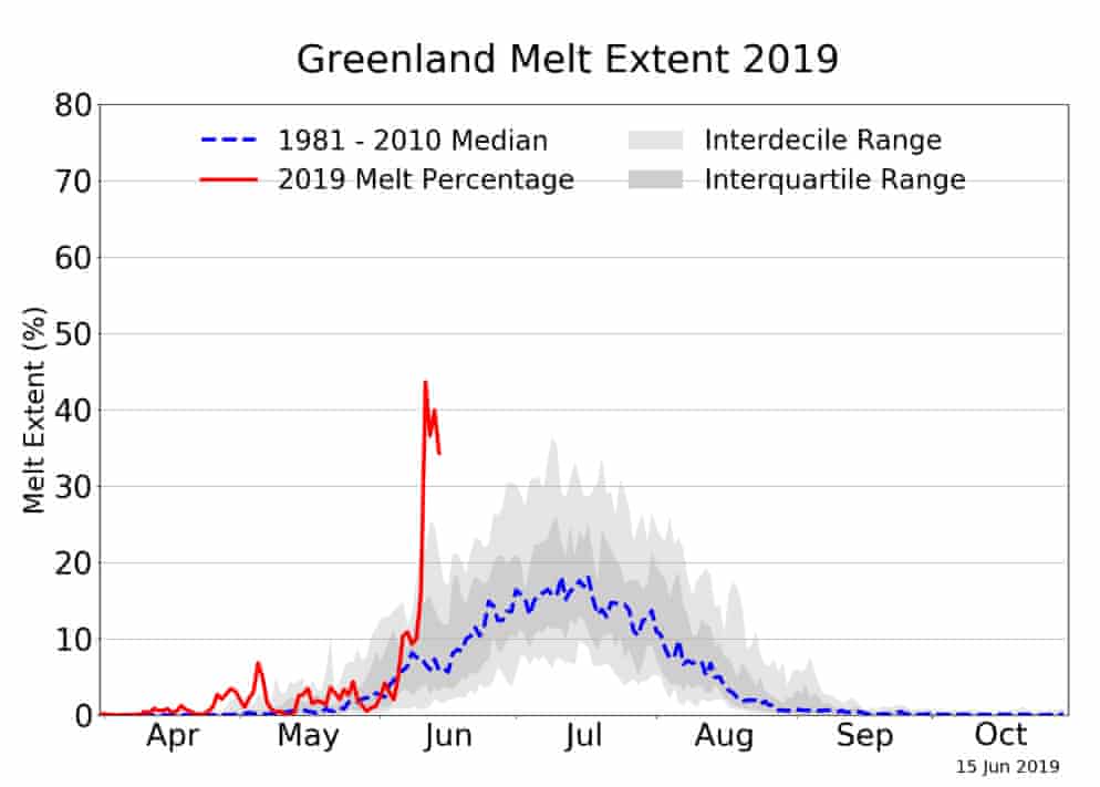
The blue curve shows the median percentage of Greenland ice melt over the last few decades. There’s natural year-to-year variation around that average, and as with any statistical analysis, it’s important to understand what types of variations are normal before deciding whether any particular observation is unusual or not. So, in this case, the dark grey area shows the range of values were observed in 50% of years; the light grey area is what was observed in 90% of years. So, you’d only expect observations outside the light grey area once every ten years. Moreover, the further an observation falls outside of the grey area, the more anomalous it is.
Now, look at the trace for 2019 shown in red. The value for June isn’t just outside the normal range of variation, it’s way outside. And it’s not only an unusually extreme observation for June; it would be extreme for the hottest part of the year in July. At it’s worst (so far), the melt for June 2019 reached over 40%, whereas the average in mid-July is around 18%, with a value of about 35% being exceeded only once in every 10 years.
So, note how much information can be extracted from a single well-designed graph. We can see:
- The variation across the calendar of the average ice melt;
- The typical variation around the average – again across the calendar – in terms of an interval expected to contain the true value on 50% of occasions: the so-called inter-quartile range;
- A more extreme measure of variation, showing the levels that are exceeded only once every 10 years: the so-called inter-decile range;
- The trace of an individual year – up to current date – which appears anomalous.
In particular, by showing us the variation in ice melt both within years and across years we were able to conclude that this year’s June value is truly anomalous.
Now let’s look at another graph. These are average spring temperatures, not for Greenland but for Alaska, where there are similar concerns about ice melt caused by increased atmospheric temperatures.

Again, there’s a lot of information:
- Each dot is an average spring temperature, one per year;
- The dots have been coloured: most are black, but the blue and red ones correspond to the ten coldest and hottest years respectively;
- The green curve shows the overall trend;
- The value for 2019 has been individually identified.
And the picture is clear. Not only has the overall trend been increasing since around the mid-seventies, but almost all of the hottest years have occurred in that period, while almost none of the coldest have. In other words, the average spring temperature in Alaska has been increasing over the last 50 years or so, and is hotter now than it has been for at least 90 years (and probably much longer).
Now, you don’t need to be a genius in biophysics to understand the cause and effect relating temperature and ice. So the fact that extreme ice melts are occurring in the same period as extreme temperatures is hardly surprising. What’s maybe less well-known is that the impact of these changes has a knock-on effect way beyond the confines of the Arctic.
So, even if dogs walking on the water of the arctic oceans seems like a remote problem, it’s part of a chain of catastrophic effects that will soon affect our lives too. Statistics has an important role to play in determining and communicating the presence and cause of these effects, and the better we all are at understanding those statistics, the more likely we will be able to limit the damage that is already inevitable. Fortunately, our governments are well aware of this and are taking immediate actions to remedy the problem.
Oh, wait…
In the beautiful Midwest, windchill temperatures are reaching minus 60 degrees, the coldest ever recorded. In coming days, expected to get even colder. People can’t last outside even for minutes. What the hell is going on with Global Waming? Please come back fast, we need you!
— Donald J. Trump (@realDonaldTrump) January 29, 2019
… scrap that, better take action ourselves.