The above graph is included in the following tweet sent by CEA which is the Council of Economic Advisors to the US White House.
To better visualize observed data, we also continually update a curve-fitting exercise to summarize COVID-19's observed trajectory. Particularly with irregular data, curve fitting can improve data visualization. As shown, IHME's mortality curves have matched the data fairly well. pic.twitter.com/NtJcOdA98R
— CEA45 Archived (@WhiteHouseCEA45) May 5, 2020
The fluctuating black line shows the number of deaths due to Coronavirus per day in the US. The coloured dotted lines are model estimates and predictions produced at different time points. I’m not sure I need to make the points, but:
- The CEA claim that the mortality curves have “matched the data fairly well” is open to question.
- Accepting that a model fits well over a period of observed data is no real basis for assuming the model can be extrapolated into the future. The various model predictions here imply there will be zero new deaths in the US from a range of dates between 16th May and 4th August. All serious epidemiological models for the same process would describe such possibilities as somewhere between impossible and negligible.
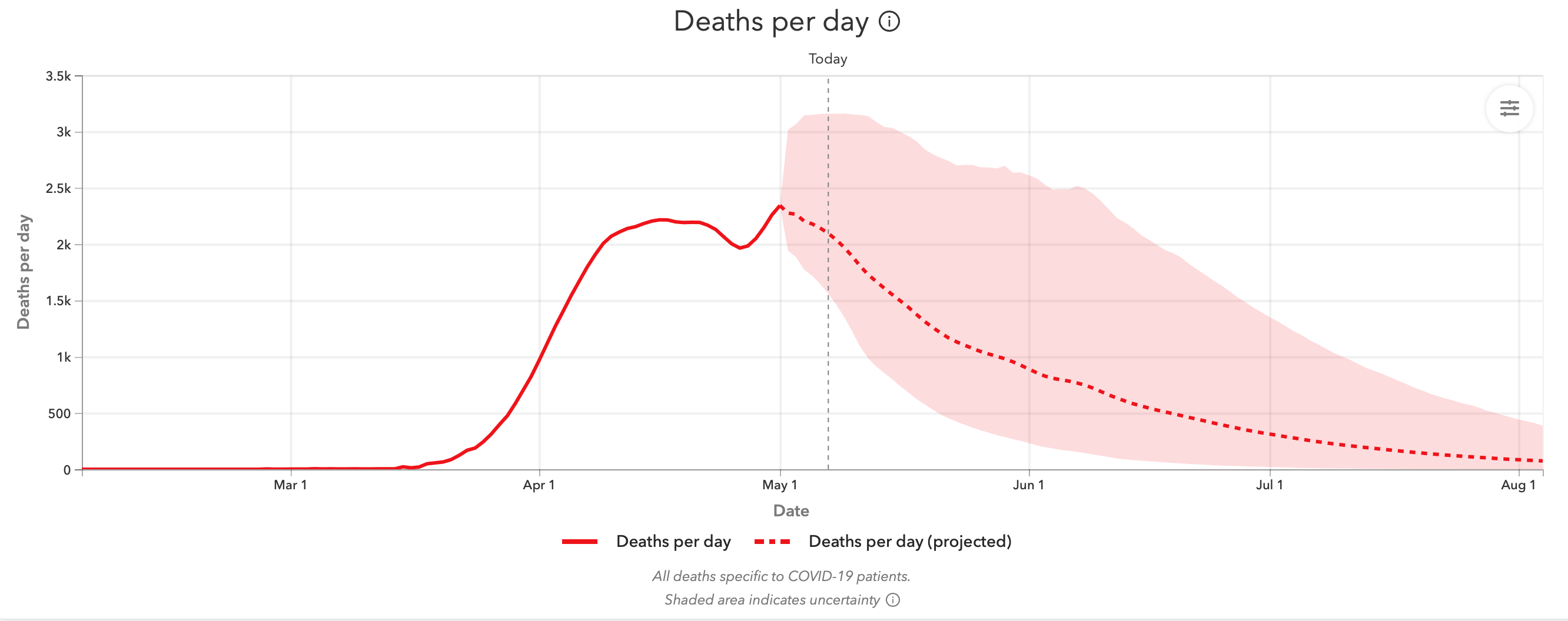
To be fair to the authors of the IHME model – whose details are available here – the detailed projections shown here as of 1st May do include measures of uncertainty as per the following graph:

Nonetheless, given that the current state is at best in a state of plateau, and at worst on an upward trajectory, it seems unduly optimistic that the trend will now be for a negative decline that’s almost as fast as the exponential growth in the early phase of the epidemic.
But let’s give this model, which is at least based on epidemiological assumptions, the benefit of any doubt. The CEA graph also includes a so-called “cubic fit” which is the one that leads to an estimate of zero deaths as of 16th May. There are no details as to how this has been obtained, but presumably someone has simply carried out a regression on the data of the black curve using a smooth curve (technically a 3-degree polynomial). But such a curve is bound to go negative at some point. Now if you look carefully at the cubic fit in the CEA graph, there’s a point where the curve changes from dashes to dots. My guess is that someone simply altered the cubic fit so as to stop it going negative. Unfortunately, zero deaths on 16th May is almost as improbable as negative deaths, so they might as well have not bothered.
Anyway, this epidemic has brought out the best and the worst of Statistics. I guess you can work out where the CEA analysis falls on this range.
Comments:
- Thanks to Rickie for showing me the CEA tweet.
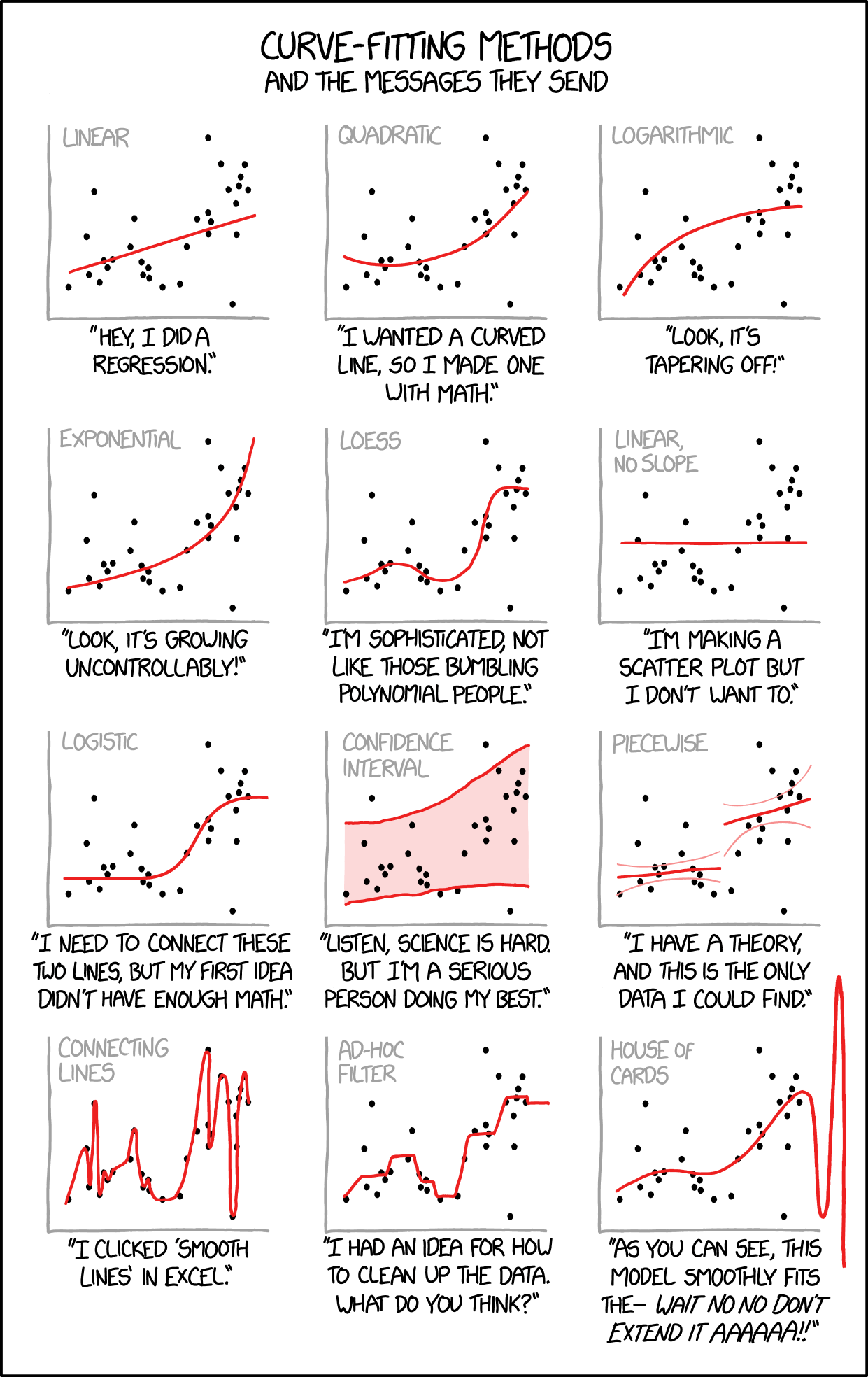
- This cartoon seems relevant right now:

