One of the themes I’ve tried to develop in this blog is the connectedness of Statistics. Many things which seem unrelated, turn out to be strongly related at some fundamental level.
Last week I posted the solution to a probability puzzle that I’d posted previously. Several respondents to the puzzle, including Olga, included the logic they’d used to get to their answer when writing to me. Like the others, Olga explained that she’d basically halved the number of coins in each round, till getting down to (roughly) a single coin. As I explained in last week’s post, this strategy leads to an answer that is very close to the true answer.
Anyway, Olga followed up her reply with a question: if we repeated the coin tossing puzzle many, many times, and plotted a histogram of the results – a graph which shows the frequencies of the numbers of rounds needed in each repetition – would the result be the typical ‘bell-shaped’ graph that we often find in Statistics, with the true average sitting somewhere in the middle?
Now, just to be precise, the bell-shaped curve that Olga was referring to is the so-called Normal distribution curve, that is indeed often found to be appropriate in statistical analyses, and which I discussed in another previous post. To answer Olga, I did a quick simulation of the problem, starting with both 10 and 100 coins. These are the histograms of the results.
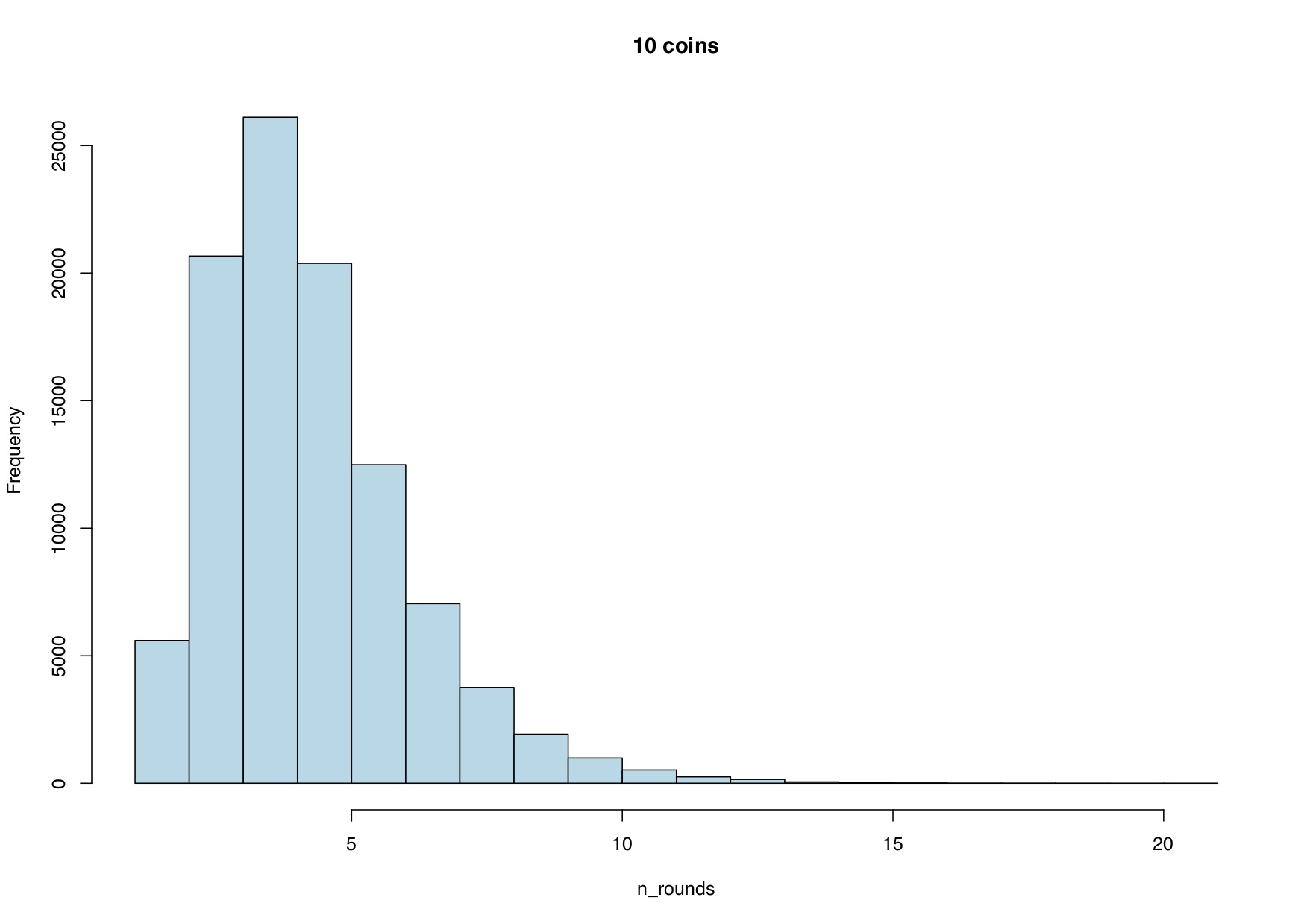
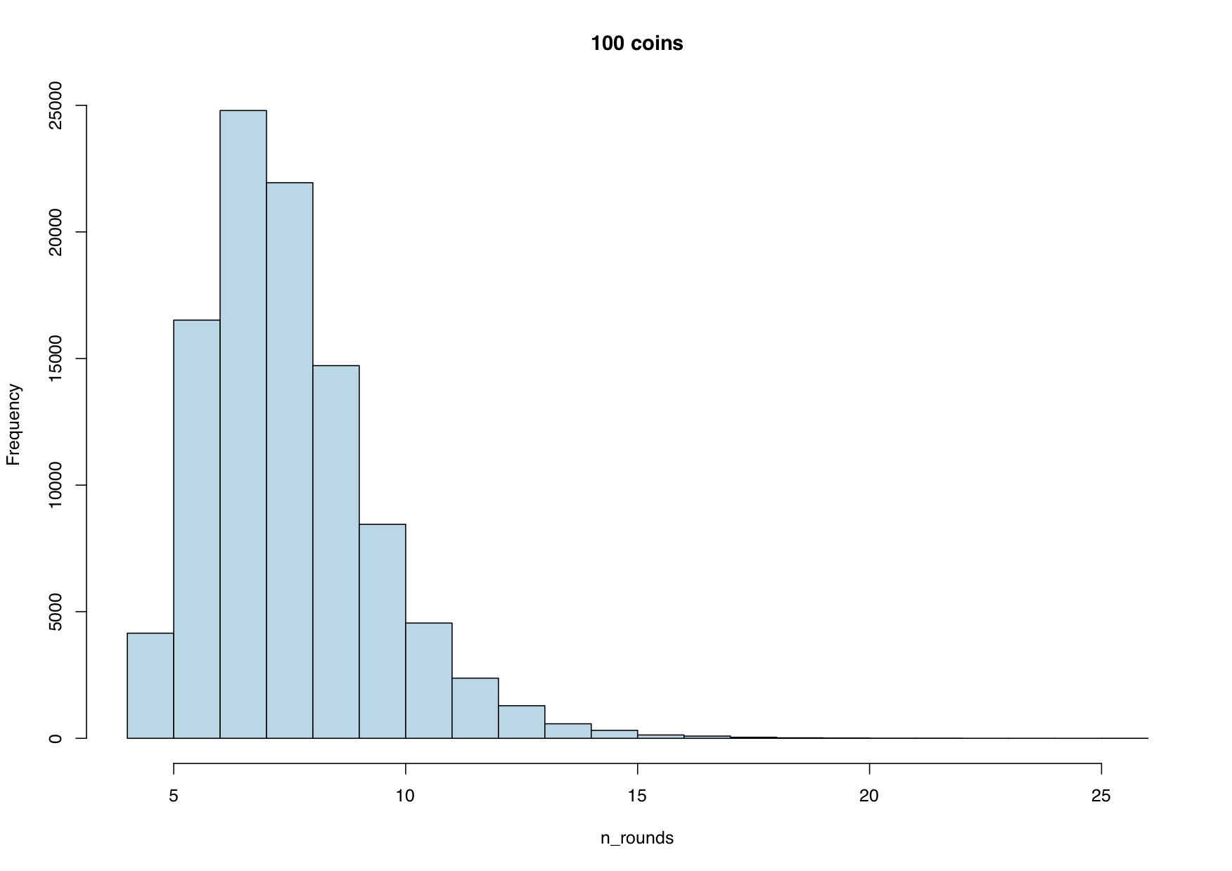
So, as you’d expect, the average values (4.726 and 7.983 respectively) do indeed sit nicely inside the respective distributions. But, the distributions don’t look at all bell-shaped – they are heavily skewed to the right. And this means that the averages are closer to the lower end than the top end. But what is it about this example that leads to the distributions not having the usual bell-shape?
Well, the normal distribution often arises when you take averages of something. For example, if we took samples of people and measured their average height, a histogram of the results is likely to have the bell-shaped form. But in my solution to the coin tossing problem, I explained that one way to think about this puzzle is that the number of rounds needed till all coins are removed is the maximum of the number of rounds required by each of the individual coins. For example, if we started with 3 coins, and the number of rounds for each coin to show heads for the first time was 1, 4 and 3 respectively, then I’d have had to play the game for 4 rounds before all of the coins had shown a Head. And it turns out that the shape of distributions you get by taking maxima is different from what you get by taking averages. In particular, it’s not bell-shaped.
But is this ever useful in practice? Well, the Normal bell-shaped curve is somehow the centrepiece of Statistics, because averaging, in one way or another, is fundamental in many physical processes and also in many statistical operations. And in general circumstances, averaging will lead to the Normal bell-shaped curve.
Consider this though. Suppose you have to design a coastal wall to offer protection against sea levels. Do you care what the average sea level will be? Or you have to design a building to withstand the effects of wind. Again, do you care about average winds? Almost certainly not. What you really care about in each case will be extremely large values of the process: high sea-levels in one case; strong winds in the other. So you’ll be looking through your data to find the maximum values – perhaps the maximum per year – and designing your structures to withstand what you think the most likely extreme values of that process will be.
This takes us into an area of statistics called extreme value theory. And just as the Normal distribution is used as a template because it’s mathematically proven to approximate the behaviour of averages, so there are equivalent distributions that apply as templates for maxima. And what we’re seeing in the above graphs – precisely because the data are derived as maxima – are examples of this type. So, we don’t see the Normal bell-shaped curve, but we do see shapes that resemble the templates that are used for modelling things like extreme sea levels or wind speeds.
So, our discussion of techniques for solving a simple probability puzzle with coins, leads us into the field of extreme value statistics and its application to problems of environmental engineering.
But has this got anything to do with sports modelling? Well, the argument about taking the maximum of some process applies equally well if you take the minimum. And, for example, the winner of an athletics race will be the competitor with the fastest – or minimum – race time. Therefore the models that derive from extreme value theory are suitable templates for modelling athletic race times.
So, we moved from coin tossing to statistics for extreme weather conditions to the modelling of race times in athletics, all in a blog post of less than 1000 words.
Everything’s connected and Statistics is a very small world really.