In an earlier post I gave two examples of Simpson’s paradox. The first example concerned the success rate of two different procedures for the removal of kidney stones; the second concerned the batting averages of two baseball players. In both cases there seemed to be a contradiction in the data depending on how the data were analysed. I’d like now to try to explain this phenomenon.
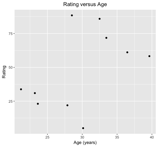
Though the context is slightly different and I’ve actually just invented the data, you can perhaps see what might be happening from the following picture. These are (fictional) measures of ratings of a number of sportspeople against their age. What conclusions would you draw?

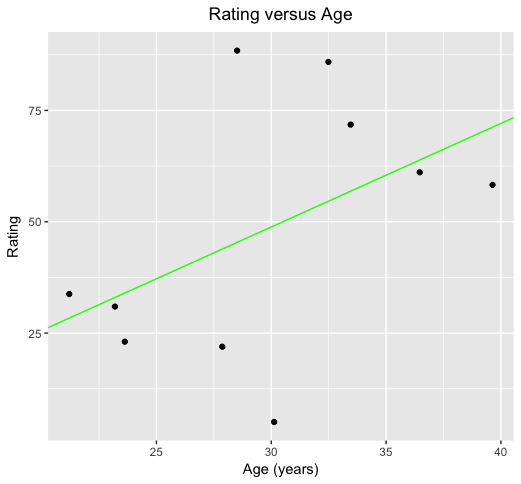
It’s a noisy picture, but the general pattern seems to be that rating improves with age. Indeed, if I use standard statistical procedures to estimate the general trend in this picture I get the green line as shown below:

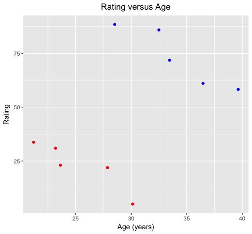
This confirms a general tendency for rating to improve with age (notwithstanding some variation around the general trend). But suppose I now tell you that actually these data correspond to several observations through time on just two players. In the plot below, I’ve coloured the observations separately for the two players. What do you conclude now?

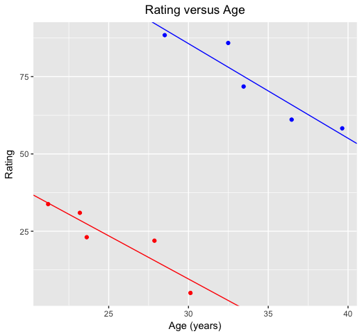
You’d probably conclude that the blue player is more highly rated than the red player, but for both players ratings reduce with age. This is again confirmed with formal estimates of trend lines for each of the players:

So, when looking at the two players separately, age causes ratings to go down for each player. But aggregating the player data, as we did in the first plot, leads to the misleading conclusion that age tends to result in increased ratings. It does for the aggregated data if we ignore the player information, but the more likely explanation for that is that the older of the two players in our data just happens to be a much better player, and that the real effect of age is a reduction in ratings for both players.
This is Simpson’s paradox: by ignoring a hidden variable (in this case the player identifier) we get a misleading picture of the relationship between the original variables (rating and age). Sure, ratings increase with age, but only because the older player had much higher ratings overall. Looking separately at each player, ratings go down with age.
A version of this same phenomenon occurs in each of the examples from the previous post.
- If you look back at the kidney stones data, doctors tended to give treatment A to patients with the more severe disease (larger kidney stones). This reduces the success rate for treatment A; not because it’s a less effective treatment, but because it’s being used on patients whose condition is more severe. Indeed, it looked like treatment B was best from the aggregate data. But the true story emerges from the original tables: treatment A is best for all patients.
- Simpson’s paradox arises in the baseball example because of the large differences in the number of appearances at the plate per year for the two batsmen. Derek Jeter has far more appearances in 1996 than 1995; for David Justice it is the reverse. This means that the aggregate batting average for Jeter is close to his ’96 value, while for Justice it is his ’95 value. Moreover both players had better averages in ’96 compared to ’95. Consequently, the overall averages favour Jeter, who had most of his appearances in ’96, the year in which the averages were higher. Yet even in ’96 Justice’s average was higher; it’s just that it was based on relatively few appearances. Clearly, Derek Jeter was the better batter over the entire period, despite the quirk of having a lower average than David Justice in both years.
What’s especially interesting from these two examples is that the ‘correct’ resolution of the paradox is completely different in the two cases. For the medical example, taking the experimental situation into account, the non-aggregate interpretation is best: treatment A was best for both types of kidney stone and should be preferred, even though treatment B had the highest overall success rate. But with the baseball data, Derek Jeter was the superior batter since he had the highest overall average, even though his average was beaten by that of David Justice in both years.
The moral is that Statistics is bound to be a more intricate process than that of simple number crunching. Here we had two different situations which led to the same phenomenon of Simpson’s paradox. But in one case an understanding of the experimental setting supports a non-aggregated solution; in the other the aggregate solution is best. Context is everything: treat data as if they are numbers without context and there’s a very good chance you’ll draw entirely the wrong conclusions.
Harry pointed me to a gif that illustrates Simpson’s paradox in much the same way as my non-animated graphs above. I’m not sure this is exactly the gif Harry suggested, but the gist is much the same. So if you prefer your Simpson’s paradox explanations all-dancing and in Technicolor, here you go:
Simpson's paradox [GIF] pic.twitter.com/tRP7OIHhib
— John B. Holbein (@JohnHolbein1) October 3, 2018
You probably get the idea by now. Looking at just the raw data (the black dots before the animation starts) there is a strong downward trend (shown by the red line once you start the video). But if you let the video roll you’ll see that different groups of the data belong to different individuals, as indicated by the different colours. The trend line for every one of those individuals is positive, even though the overall trend was distinctly negative.
