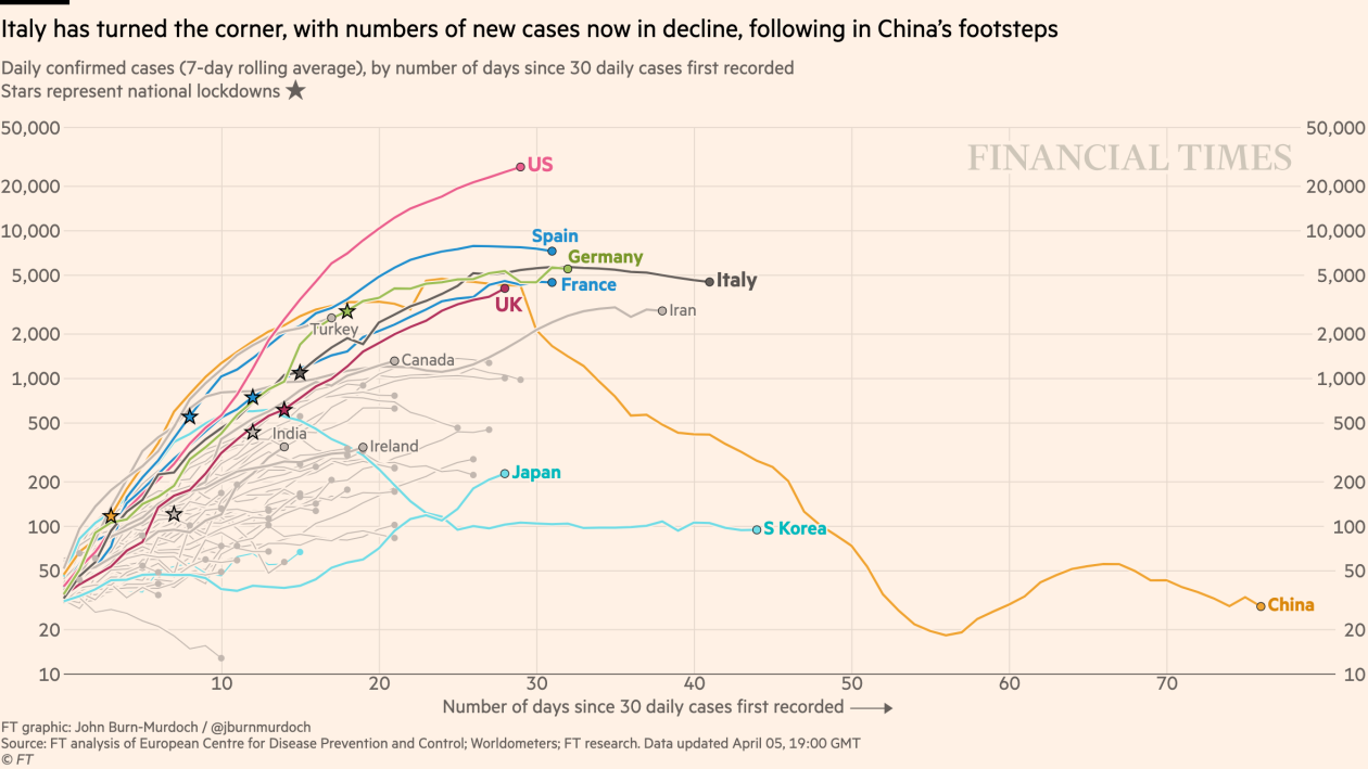
The graph above is the latest (as of 5th April) update from the FT showing a 7-day rolling average of the number of new COVID-19 confirmed cases through time for a number of countries. The point of using a 7-day rolling average – which means each value is the average of the previous 7-days’ values – is to reduce the effect of randomness in day-to-day variations, so as to get a smoother picture of trends. As discussed in previous posts, it’s possibly misleading to use confirmed cases as a strict measure of the epidemic scale, since the number of confirmed cases will depend in part on the protocol for testing, which varies from country to country, and even within each country through time. Nonetheless, it’s likely to be broadly interpretable as an indicator of epidemic strength.
Notwithstanding this issue, if the epidemic were growing exponentially in any country, the graph would show as a straight line on this logarithmic scale. To a greater or lesser extent, the curves for almost all countries show a tendency to flatten through time, especially from the time that social measures have been applied to limit potential transmissions through contact. The curve for the UK remains stubbornly close to linear, but its lockdown was introduced later – in relative terms – than for most other European countries. The curve for Italy seems to have flattened quicker than for other countries – again relative to when the country was placed on lockdown – but that’s probably because severe local restrictions were placed on the worst-affected regions some time before the entire country was placed on lockdown.
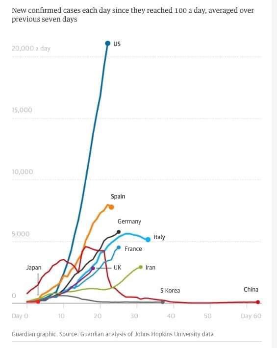
But anyway…. the point I wanted to make in this post is a little different. There are several reasons why it’s a good idea to use a logarithmic scale in graphs like the one above. Mostly this is because there are good epidemiological reasons to believe – as discussed here – that an unchecked epidemic will grow exponentially. And exponential growth on a logarithmic scale will appear linear, which makes comparisons and contrasts much easier. But one disadvantage of the logarithmic scale in this context is that it can give a false impression as to the degree of similarity between countries. Looking at the above graph, it’s true that the trajectory for the United States looks currently worse than that for other countries, but not so much worse. But now look at the same graph, from a day or two earlier, on a linear, instead of logarithmic, scale:

On this scale the difference in trajectory for the United States relative to each of the other countries is much more apparent. The current level is very much greater, while the tendency for growth is also considerably more dramatic.
In summary, different scales for graphs are useful for different purposes. And though the logarithmic scale is better than a linear scale for most purposes in tracking an epidemic, it’s only once you put things back on a linear scale that you get a true sense of how different the epidemic currently is on the ground in different countries.
