
When Matthew was asked at a recent offsite for book recommendations, his first suggestion was Thinking, Fast and Slow. This is a great book, full of insights that link together various worlds, including statistics, economics and psychology. Daniel Kahneman, the book’s author, is a world-renowned psychologist in his own right, and his book makes it clear that he also knows a lot about statistics. However, in a Guardian article a while back, Kahneman was asked the following:
Interestingly, it’s a fact that highly intelligent women tend to marry men less intelligent than they are. Why do you think this might be?
He answered as follows:
It’s a fact – but it’s not interesting at all. Assuming intelligence is similarly distributed between men and women, it’s just a mathematical inevitability that highly intelligent women, on average, will be married to men less intelligent than them. This is “regression to the mean”, and all it really tells you is that there’s no perfect correlation between spouses’ intelligence levels. But our minds are predisposed to try to construct a more compelling explanation.
<WOMEN: please insert your own joke here about the most intelligent women choosing not to marry men at all.>
Anyway, I can’t tell if this was Kahneman thinking fast or slow here, but I find it a puzzling explanation of regression to the mean, which is an important phenomenon in sports modelling. So, what is regression to the mean, why does it occur and why is it relevant to Smartodds?
Let’s consider these questions by looking at a specific dataset. The following figure shows the points scored in the first and second half of each season by every team in the Premier League since the inaugural 1992-93 season. Each point in the plot represents a particular team in a particular season of the Premier League. The horizontal axis records the points scored by that team in the first half of the season; the vertical axis shows the number of points scored by the same team in the second half of the same season.
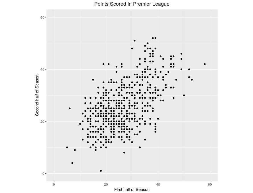 Just to check your interpretation of the plot, can you identify:
- The point which corresponds to Sunderland’s 2002-03 season where they accumulated just a single point in the second half of the season?
- The point which corresponds to Man City’s 100-point season in 2017-18?
Click here to see the answers.
Now, let’s take that same plot but add a couple of lines as follows:
- The red line divides the data into roughly equal sets. To its left are the points that correspond to the 50% poorest first-half-of-season performances; to its right are the 50% best first-half-of-season performances.
- The green line corresponds to teams who had an identical performance in the first and second half of a season. Teams below the green line performed better in the first half of a season than in the second; teams above the green line performed better in the second half of a season than in the first.
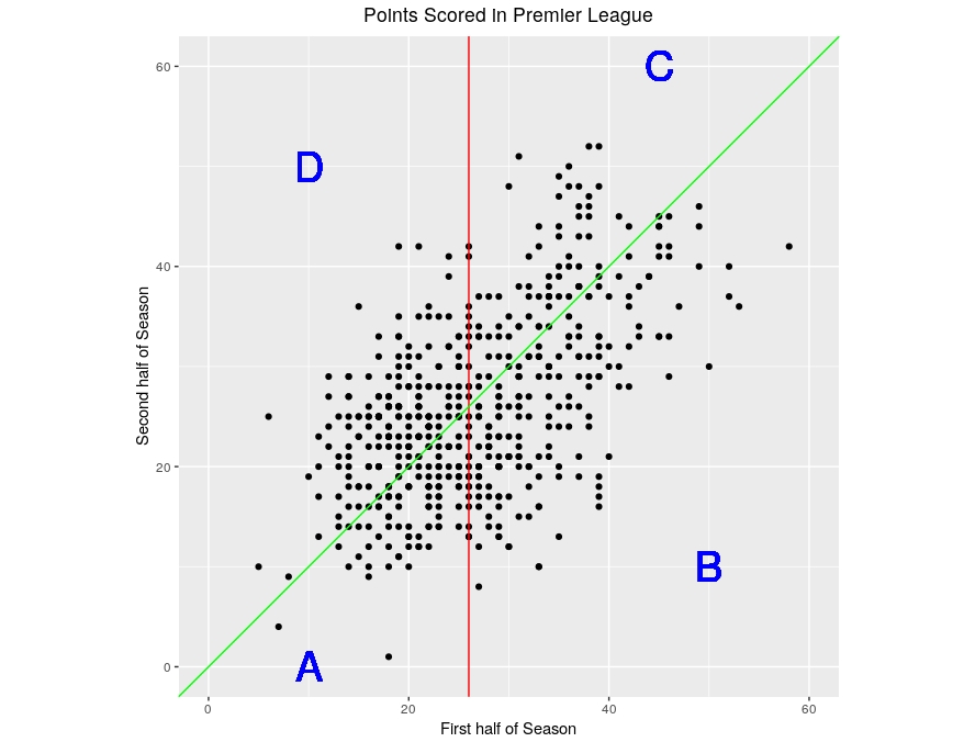
In this way the picture is divided into 4 regions that I’ve labelled A, B, C and D. The performances within a season of the teams falling in these regions are summarised in the following table:
| First Half | Best half | Number of points | |
|---|---|---|---|
| A | Below average | First | 94 |
| B | Above average | First | 174 |
| C | Above average | Second | 71 |
| D | Below average | Second | 187 |
I’ve also included in the table the number of points in each of the regions. (Counting directly from the figure will give slightly different numbers because of overlapping points).
First compare A and D, the teams that performed below average in the first half of a season. Looking at the number of points, such teams are much more likely to have had a better second half to the season (187 to 94). By contrast, comparing B and C, the teams that do relatively well in the first half of the season are much more likely to do worse in the second half of the season (71 to 174).
This is regression to the mean. In the second half of a season teams “regress” towards the average performance: teams that have done below average in the first half of the season generally do a bit less badly in the second half; teams that have done well in the first half generally do a bit less well in the second half. In both cases there is a tendency to move – regress – towards the average in the second half. I haven’t done anything to force this; it’s just what happens.
We can also view the phenomenon in a slightly different way. Here’s the same picture as above, where points falling on the green line would correspond to a team doing equally well in both halves of the season. But now I’ve also used standard statistical methods to add a “line of best fit” to the data, which is shown in orange. This line is a predictor of how teams will perform in the second half of season given how they performed in the first, based on all of the data shown in the plot.
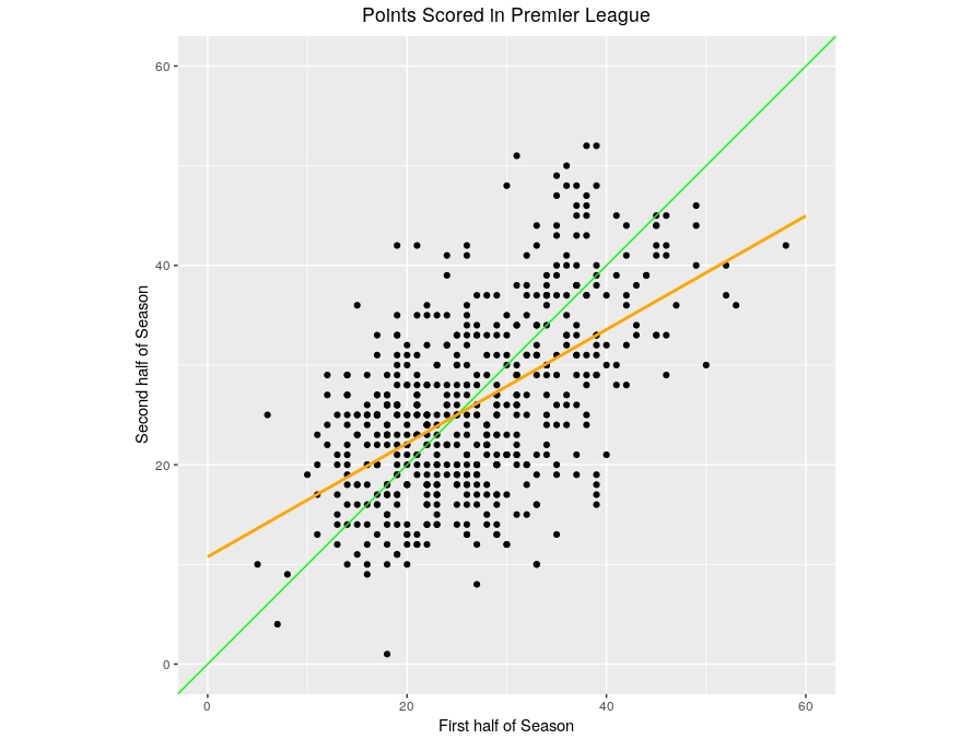
In the left side of the plot are teams who have done poorly in the first half of the season. In this region the orange line is above the green line, implying that such teams are predicted to do better in the second half of the season. On the right side of the plot are the teams who have done well in the first half of the season. But here the orange line is below the green line, so these teams are predicted to do worse in the second half of the season. This, again, is the essence of regression to the mean.
One important thing though: teams that did well in the first half of the season still tend to do well in the second half of the season; the fact that the orange line slopes upwards confirms this. It’s just that they usually do less well than they did in the first half; the fact that the orange line is less steep than the green line is confirmation of that. Incidentally, you’ve probably heard the term “regression line” used to describe a “line of best fit”, like the orange line. The origins of this term are precisely because the fit often involves a regression to the mean, as we’ve seen here.
But why should regression to the mean be such an intrinsic phenomenon that it occurs in football, psychology and a million other places? I just picked the above data at random: I’m pretty sure I could have picked data from any competition in any country – and indeed any sport – and I’d have observed the same effect. Why should that be?
Let’s focus on the football example above. The number of points scored by a team over half a season (so they’ve played all other teams) is dependent on two factors:
- The underlying strength of the team compared to their opponents; and
- Luck.
Call these S (for strength) and L (for luck) and notionally let’s suppose they add together to give the total points (P). So
P = S + LAlthough there will be some changes in S over a season, as teams improve or get worse, it’s likely to be fairly constant. But luck is luck. And if a team has been very lucky in the first half of the season, it’s unlikely they’ll be just as lucky in the second. And vice versa. For example, if you roll a dice and get a 6, you’re likely to do less well with a second roll. While if you roll a 1, you’ll probably do better on your next roll. So while S is pretty static, if L was unusually big or small in the first half of the season, it’s likely to be closer to the average in the second half. And the overall effect on P? Regression to the mean, as seen in the table and figures above.
Finally: what’s the relevance of regression to the mean to sports modelling? Well, it means that we can’t simply rely on historic performance as a predictor for future performance. We need to balance historic performance with average performance to compensate for inevitable regression to the mean effects; all of our models are designed with exactly this feature in mind.