Ok, not cheerful exactly, but optimistic.
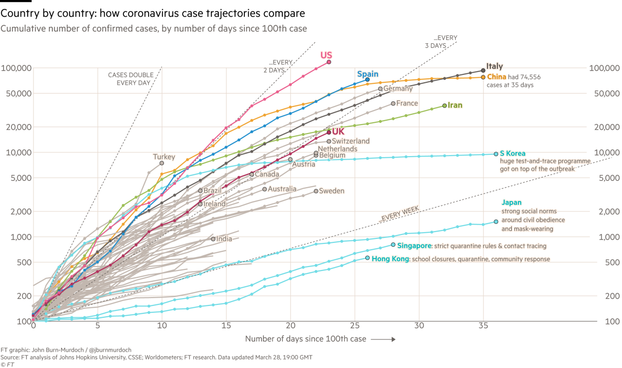
Often, looking at the same data in a different way can give a completely different perspective on things. The following graph is the updated number of reported Coronavirus cases country-by-country through time.
A few comments:
- The graph for each country is shifted so that time is measured from the first date on which 1000 cases were reported in that country. In this way the graph for each country is starting at roughly the same level.
- The graph is on a logarithmic scale, meaning that exponential growth as discussed in earlier posts, would show up as a straight line on this graph.
- Almost all countries display exponential growth at the start of the epidemic followed by a flattening, Both the rate of exponential growth and tendency to flatten varies from country to country.
- Despite the lockdowns and other restrictions imposed in many countries in recent weeks, it’s hard to convince yourself that there’s been any noticeable improvement.
And yet… based on the same data – albeit half a day later or so – the following graph shows the percentage increase in new cases – averaged over the previous week to minimise the effect of random day-to-day changes.
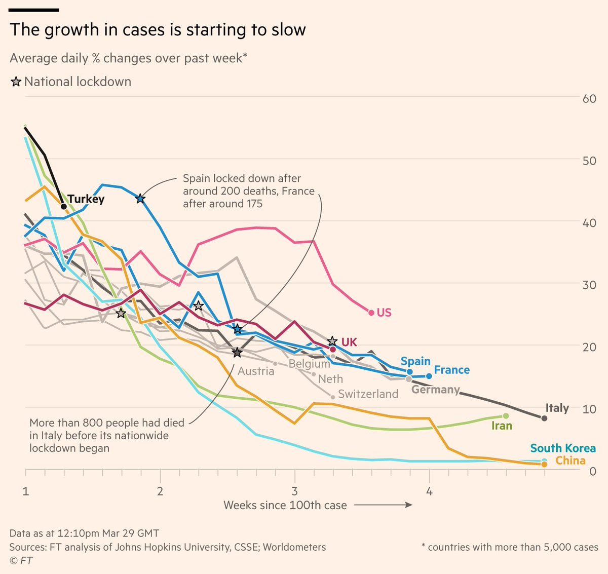
For almost all of the countries, the daily percentage increase in cases has fallen and is continuing to fall. In Italy, for example, the daily increase has gone down from around 19% to 8% in the space of a couple of weeks. The trend in the UK is also downwards, but by a smaller amount. However, enforced social controls have only been in place in the UK for less than a week.
One slight caveat is that the information from these graphs is limited to confirmed cases. This means that:
- The numbers themselves are bound to be an underestimate of the number of infected individuals in a country;
- Comparisons between countries are complicated by the fact that some countries are testing many more individuals than others;
- And the trajectory for each country is also complicated by possible changes in testing protocols as the epidemic has evolved.
Nonetheless, the overall trends in these graphs are likely to be broadly indicative of a slowing of the epidemic in almost all countries. The picture for the US is especially complicated however due to wide scale state-by-state differences in testing protocols, that are also changing rapidly in time.
Of course, what we’re seeing in terms of changes in growth rate is also present in the graph above on case numbers. The almost linear reduction in growth rates is due to the slight flattening of the curves of the case numbers on a logarithmic scale. It’s simply that looking at the data this way, the daily changes are highlighted and we get a more realistic – even optimistic – picture of how, despite daily numbers of cases that seem persistently high, the projection for a couple of weeks time is that the rate of new cases will be totally manageable.
So, be optimistic, cheerful even, that the social restrictions are having an effect on the epidemic growth and that there is light at the end of the tunnel.
And if you need them, here are many more reasons to be cheerful, curated by David Byrne, no less.