As you probably know, data on the state of the Coronavirus epidemic in the UK are presented and discussed at a daily press briefing. This includes a set of slides prepared by Public Health England (PHE) that give a statistical summary of the current status quo. There was slight complication in the presentation yesterday, however, since it was decided to include data on deaths that had occurred in care homes. This meant that there would be an additional increase of 5000 or so deaths. Not because these deaths had suddenly occurred, but because they had occurred at some point over the last couple of months and were now to be included in the count.
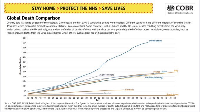
Here’s the slide on cumulative COVID-19 fatalities produced by PHE from the day before the additional data were included. 
Now imagine increasing the UK value by around 5000 and the trajectory in the UK would be closer to that of the US than to that of any other European country.
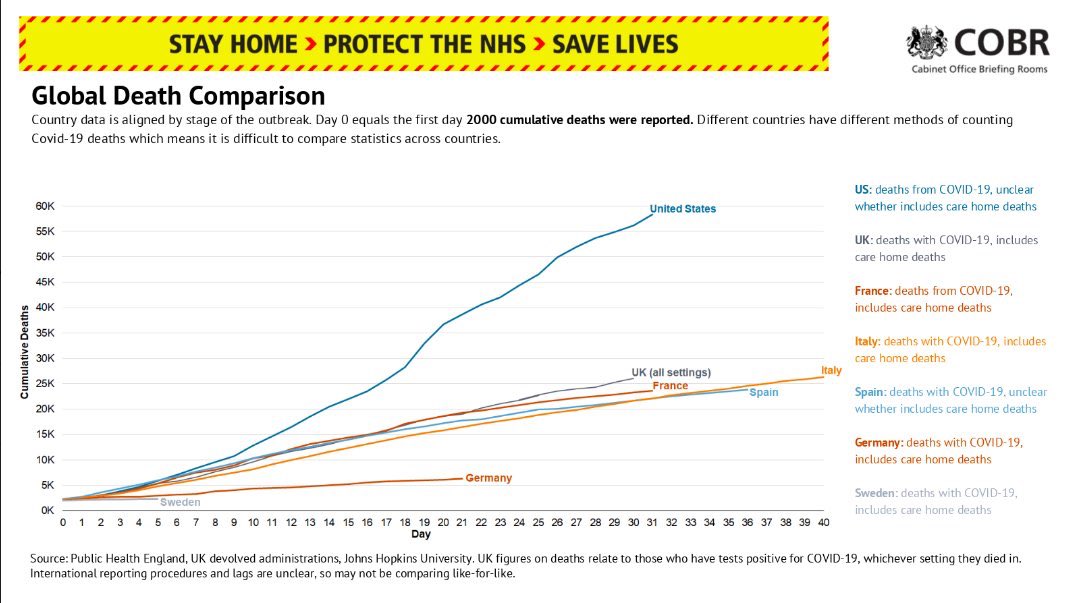
But the equivalent PHE slide shown at yesterday’s press conference was this:

The UK value is now around 25k rather than 20k, due to the inclusion of the extra data, but the UK trajectory looks pretty much like that of several other European countries. And definitely much closer to those countries than to the US.
But how is this possible? The additional data can only make the UK trajectory worse in terms of numbers of fatalities, not better.
To answer this, you have to look at the fine print of the graphs. And actually there are 2 differences:
- In the first graph, countries are aligned so that day 0 for each country is the first day on which more than 0 cumulative deaths had been reported. In the second graph, this has been changed to 2000 cumulative deaths. This results in some realignment of the trajectories across countries.
- In the first graph, only data from day 15 are shown; in the second graph data are shown all the way from day zero. This has the effect of stretching the graph sideways in the second plot, which in turn has the effect of squashing the differences in the vertical direction.
So, both of these stylistic changes to the presentation have the effect of making the UK’s trajectory of COVID-19 fatalities look less extreme relative to those of European countries.
Now, there may be some perfectly innocent explanation as to why these changes were made and it may just be a coincidence that they show the UK numbers in a better light. Or, things were chosen this way by design. But in either case, there’s an important lesson here in how simple choices in presentation can lead to completely different interpretations of the same data.
