Kirk Goldsberry is the author of a new book on data analytics for NBA. I haven’t read the book, but some of the graphical illustrations he’s used for its publicity are great examples of the way data visualization techniques can give insights about the evolution of a sport in terms of the way it is played.
Sprawlball is a book about the recent evolution of the NBA.https://t.co/lcwyRII7FJ pic.twitter.com/sZR7CHdKtu
— Kirk Goldsberry (@kirkgoldsberry) March 13, 2019
Press the start button in the graphic of the above tweet.. I’m not sure exactly how the graphic and the data are mapped, but essentially the coloured hexagons show regions of the basketball court which are the most frequent locations for taking shots. The animation shows how this pattern has changed over the seasons.
As you probably know, most goals in basketball – excluding penalty shots – are awarded 2 points. But a shot that’s scored from outside a distance of 7.24m from the basket – the almost semi-circular outer-zone shown in the figure – scores 3 points. So, there are two ways to improve the number of points you are likely to score when shooting: first, you can get closer to the basket, so that the shot is easier; or second, you can shoot from outside the three-point line, so increasing the number of points obtained when you do score. That means there’s a zone in-between, where the shot is still relatively difficult because of the distance from the basket, but for which you only get 2 points when you do score. And what the animation above clearly shows is an increasing tendency over the seasons for players to avoid shooting from this zone. This is perhaps partly because of a greater understanding of the trade-off between difficulty and distance, and perhaps also because improved training techniques have led to a greater competency in 3-point shots.
Evidence to support this reasoning is the following data heatmap diagram which shows the average number of points scored from shots taken at different locations on the court. The closer to red, the higher the average score per shot. 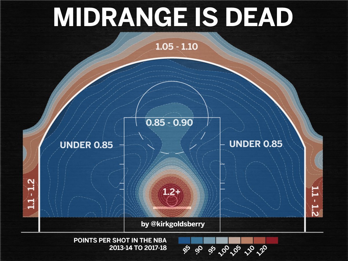
Again the picture makes things very clear: average points scored are highest when shooting from very close to the basket, or from outside of the 3-point line. Elsewhere the average is low. It’s circumstantial evidence, but the fact that this map of points scored has patterns that are so similar to the current map of where players are shooting from, there’s a strong suggestion that players have evolved their play style in order to shoot at the basket from positions which they know are more likely to generate the most points.
In summary, creative use of both static and animated graphical data representations provide great insights about the way basketball play has evolved, and why that evolution is likely to have occurred, given the 3-point shooting rule.
Thanks to Benoit for posting something along these lines on RocketChat.