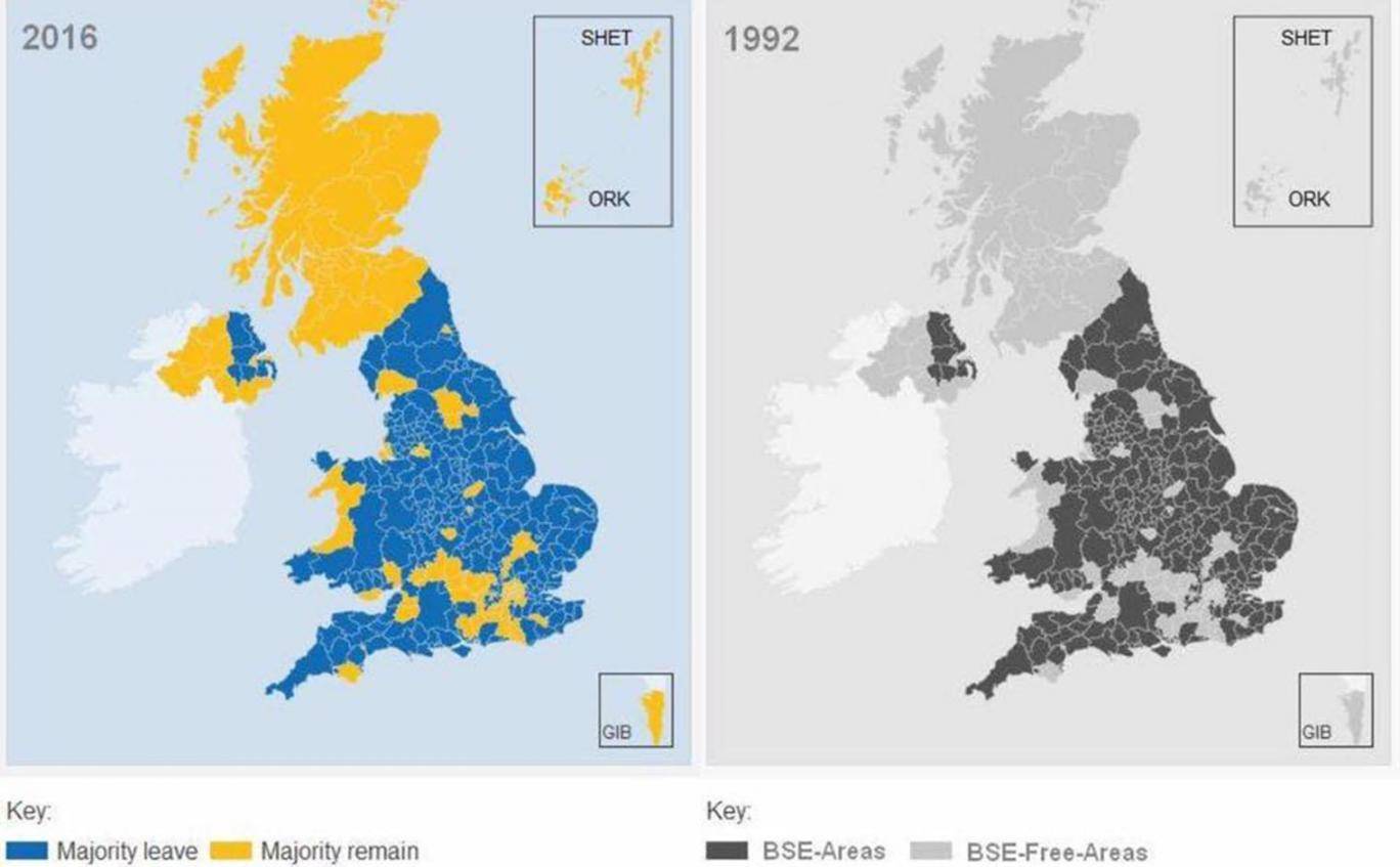
A while back, when I was touting the idea of Smartodds loves Statistics to the Smartodds management, I also asked for ideas for possible posts. Nity very kindly suggested a post based on the following analysis, which had actually been doing the rounds on social media circles for some time.

The map on the left shows the UK by county according to whether the county voted predominantly ‘leave’ (blue) or ‘remain’ (yellow) in the 2016 referendum. The map on the right shows incidences of mad cow disease in the 1992 outbreak: counties that were affected are coloured black; those unaffected are coloured grey. It’s brilliant. As you can see, there’s a near-perfect correspondence between counties affected by mad cow disease in 1992 and counties that leant towards Brexit in the referendum 24 years later.
Brilliant, but sadly not true.
Actually, it’s literally ‘too good to be true’. There’s not just a near-perfect correspondence between the two figures, there’s a perfect correspondence. If I take the figure on the right and colour the black bits blue and the grey bits yellow I get an exact replicate of the figure on the left. Even if there really were a strong relationship between mad cow disease and Brexit, the nature of random variation means it’s virtually impossible we’d get a perfect tie-up like this. Someone has simply taken the correct map on the left, changed blue for black, yellow for grey, and changed the legend.
So, what probably was intended just as a bit of a joke gained momentum via social media, and ends up being ‘Fake News’. Unfortunately, this ends up being a bit counterproductive, both for Statistics as a science, and in the argument against Brexit. Because if it’s easy (and correct) to dismiss this analysis as fake news, it becomes much easier to dismiss all scientific analyses, most of which are serious and accurate, in the same way.
Remember this?
[youtube https://www.youtube.com/watch?v=GGgiGtJk7MA?start=62&end=66&w=560&h=315]
Does this have anything to do with Smartodds? Well, yes and yes. Yes, because Statistics is the core activity of Smartodds provision to its clients, and since Statistics is a joined-up-subject, anything with a statistical element to it is of relevance. And yes in a more direct way, because looking for patterns in data that are too good to be true is an important service to clients. Not so much in historical results data, but in live market data, where prices that seem too good to be true, probably are due to match-fixing. So what seems like a fantastic price is actually a terrible price because the match is fixed against that particular outcome. Identifying implausible patterns in market data is not such a black-and-white (and blue-and-yellow) process as for the maps above, but the principle is much the same, and we’ll perhaps look at it in greater detail in a future post.
By the way: October 20th
