If you don’t see why this cartoon is funny, hopefully you will by the end of this post.
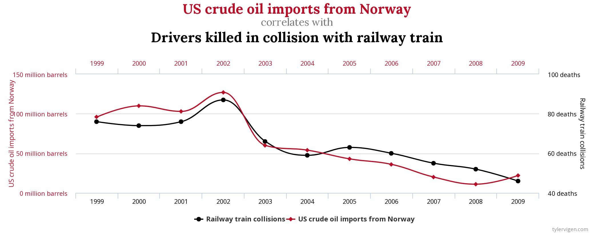
The following graph shows the volume of crude oil imports from Norway to the US and the number of drivers killed in collisions with trains, each per year:

There is clearly a very strong similarity between the two graphs. To determine the strength of similarity the standard way of measuring statistical association between two series is with the correlation coefficient. If the two series were completely unrelated the correlation coefficient would be zero. If they were perfectly in synch it would be 1. For the two series in the graph the correlation coefficient is 0.95, which is pretty close to 1. So, you’d conclude that crude oil imports and deaths due to train collisions are strongly associated with one another – as one goes up, so does the other, and vice versa.
But this is crazy. How can oil imports and train deaths possibly be related?
This is just one of a number of examples of spurious correlations kindly sent to me by Olga. Other examples there include:
- The number of deaths by drowning and the number of films Nicolas Cage has appeared in;
- Cheese consumption and the number of deaths by entanglement in bedsheets;
- Divorce rates and consumption of margarine.
In each case, like in the example above, the correlation coefficient is very close to 1. But equally in each case, it’s absurd to think that there could be any genuine connection between the processes, regardless of what statistics might say. So, what’s going on? Is Statistics wrong?
No, Statistics is never wrong, but the way it’s used and interpreted often is.
There are two possible explanations for spurious correlations like the one observed above:
- The processes might be genuinely correlated, but not due to any causal relationship. Instead, both might be affected in the same way by some other variable lurking in the background. Wikipedia gives the example of ice cream sales being correlated with deaths by drowning. Neither causes the other, but they tend to be simultaneously both large or low – and therefore correlated – because each increases in periods of very hot weather.
- The processes might not be correlated at all, but just by chance due to random variation in the data, they look correlated. This is unlikely to happen with just a single pair of processes, but if we scan through enough possible pairs, some are bound to.
Most likely, for series like the one shown in the graph above, there’s a bit of both of these effects in play. Crude oil imports and deaths by train collisions have probably both diminished in time for completely unrelated reasons. This is the first of those effects, where time is the lurking variable having a similar effect on both oil imports and train collisions. But on top of that, the random looking oscillations in the curves, which occur at around the same times for each series, are probably just chance coincidences. Most series that are uncorrelated won’t share such random-looking variations, but once in so often they will, just by chance. And the processes shown in the graph above might be the one pair out of thousands that have been examined which have this unusual similarity just by chance.
So, for both these reasons, correlation between variables doesn’t establish a causal relationship. And that’s why the cartoon above is funny. But if we can’t use correlation to establish whether a relationship is causal or not, what can we use?
We’ll discuss this in a future post.
Meantime, just in case you haven’t had your fill of spurious correlations, you can either get a whole book-full of them at Amazon or use this page to explore many other possible examples.
