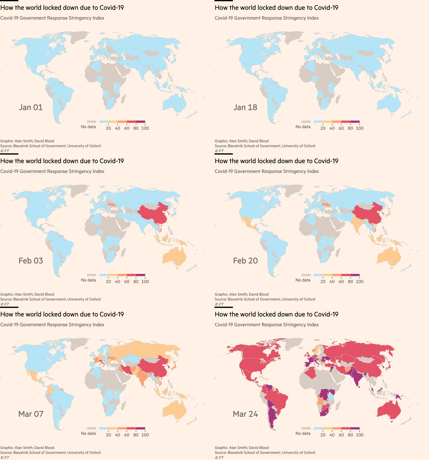
In an earlier post, I discussed the ‘stringency index’, which has recently been developed as a way of measuring how severe – stringent – a country’s response has been to the Coronavirus epidemic.
The Financial Times, as part of its live coronavirus coverage, has now produced the following animated world map of the stringency index from the start of the year up to 24 March:

It’s striking how most of the world outside of China stays blue for most of February – arguably time thrown away – and how rapidly most of the world turns red and purple from the middle of March.
As an aside, the tweet below contains a great video where John Burn-Murdoch of the FT explains several of the decisions made by his team in the way they have chosen to present graphs showing the scale of the epidemic across countries:
https://twitter.com/janinegibson/status/1244519429825802240?s=20
