It’s coming home…
Well, coming back technically. But either way the Premier League has now agreed to return to some sort of normal service on 17th June. Some leagues have already started – South Korea and Germany – with others set to follow shortly. For the time being at least, it’s starting to feel like business as usual.
So now feels like a good time to pause the blog again. Unless something happens to change my mind, this will be my final post on the Coronavirus epidemic. Thankfully, in many countries, the epidemic has been brought under partial control through social-distancing and other measures, so the debate has moved away from the science of epidemiology, in which Statistics is central, to socio-behavioural issues, in which Statistics is relevant, but less fundamental. Moreover, debate in the UK especially is increasingly focused on political aspects, and I don’t think it’s appropriate to use this forum to contribute to those discussions.
So, I’ll stop here. Thanks to those of you who have been following these posts, and especially to anyone who has commented either directly to the blog or indirectly to me personally.
By way of concluding things, I’ll just mention an article in today’s Financial Times, since it pulls together many of the themes I’ve tried to cover in these posts, while also summarising the current state of the epidemic in the UK.
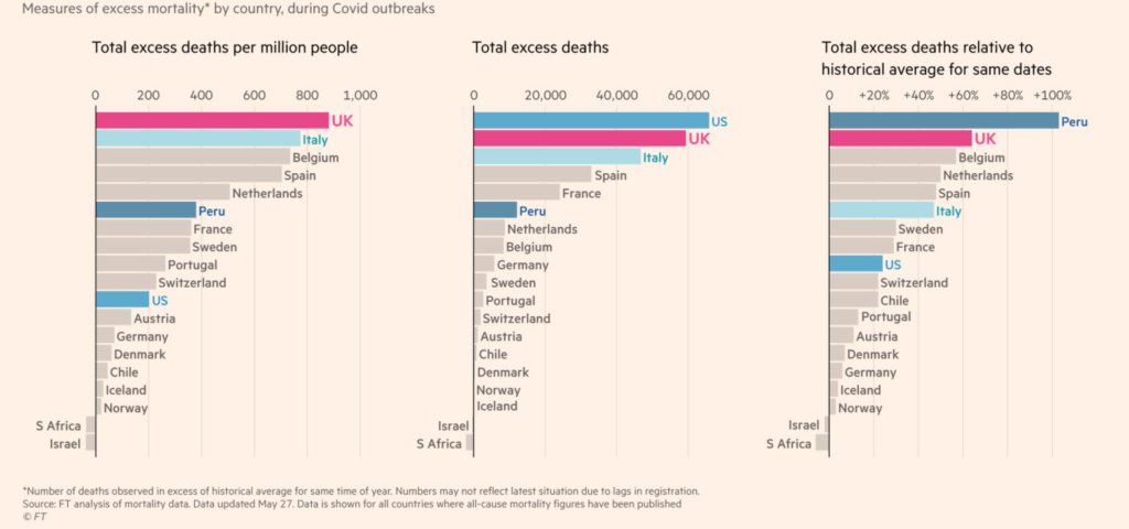
1. There’s been a lot of discussion about the fairness of comparing death rates across countries, which measure should be used, and whether numbers should be stated per capita. On balance, it’s believed that showing excess deaths per capita of population is fairest. This graph includes such a comparison:The UK fares worst by this measure, and is second worst only to the US and Peru by alternative measures.

2. Italy – from where I am writing – also does poorly by this same measure. However, Italy was hit much sooner than the UK. The UK had an advantage of several weeks of both time and evidence to help avert the crisis.
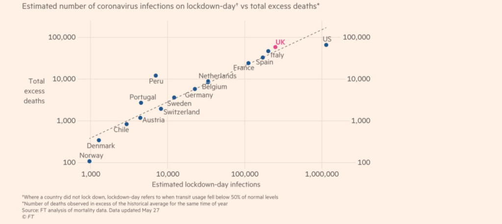
3. One of the factors for the UK’s troubled epidemic trajectory is the speed with which it ordered a nationwide lockdown. This graph shows a very strong relationship – though not necessarily causal – between the speed of lockdown and the number of excess deaths.

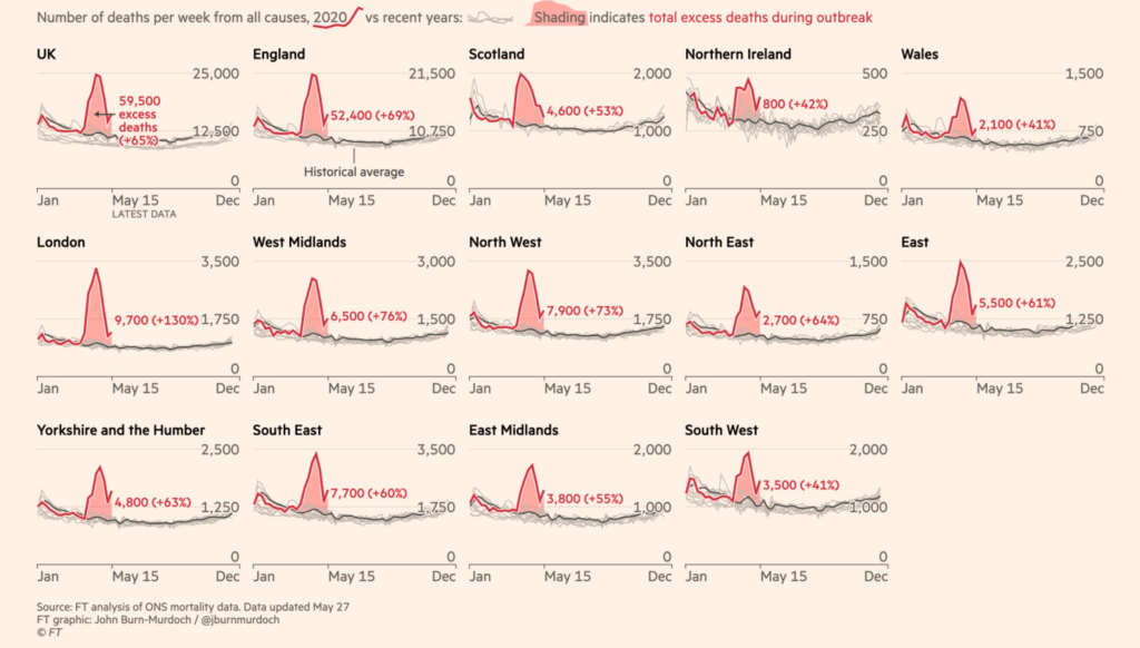
4. Another reason the UK has been so badly affected compared to other countries is the fact that cases were spread very early on in the epidemic across most of the country. In Italy most cases were, and indeed still are, concentrated in Lombardia and surrounding regions. In Spain it was Madrid and, to a lesser extent, Barcelona. In France, Paris and another region to the east close to the Swiss-German border. Having localised outbreaks made containment measures much easier and more effective compared to the situation in the UK where most regions were affected. The following graph shows the number of excess deaths through time in each of the UK regions. There are some differences, but excluding Northern Ireland, no region ended up having more than twice as many excess deaths as any other.

I’ve referred several times in the blog to the statistician Professor David Spiegelhalter, who for a period was widely quoted by the government for apparently suggesting that cross-country comparisons are inappropriate. But that was a wilful misquote of what he actually said, and a more accurate summary of his feelings on the subject are included in the FT article:
If we can believe the data from other countries, then the UK has done badly in terms of excess deaths. The issues now concern what will happen for the rest of the year, and trying to understand the processes contributing to our large excess.
Finally, though I’m planning not to write any more on this topic, there are plenty of places to keep up-to-date with statistical matters relating to the epidemic, many of which I’ve referenced in earlier posts. In particular, there’s nobody better at explaining tricky statistical ideas in simple terms than David Spiegelhalter, whose blog is available here.
