This is a quick follow-up to yesterday’s post, ‘Reasons to be cheerful’. I suggested there that looking at the same data in different ways can give you an alternative perspective on things. Specifically, I showed how looking at the rate of change in the number of new Coronavirus cases leads to a more optimistic view of how the epidemic is being brought under control, compared to just looking at the cases.
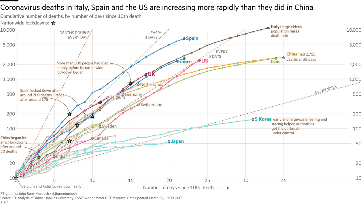
The following graph is like that of the previous post, but now showing the number of deaths due to Coronavirus through time in the worst affected countries.

Again, for most countries, there is some slight flattening of the curves, but if you live in a country like Italy, it’s difficult to see much encouragement that things are actually improving, despite the country now having been in total lockdown for 3 weeks.
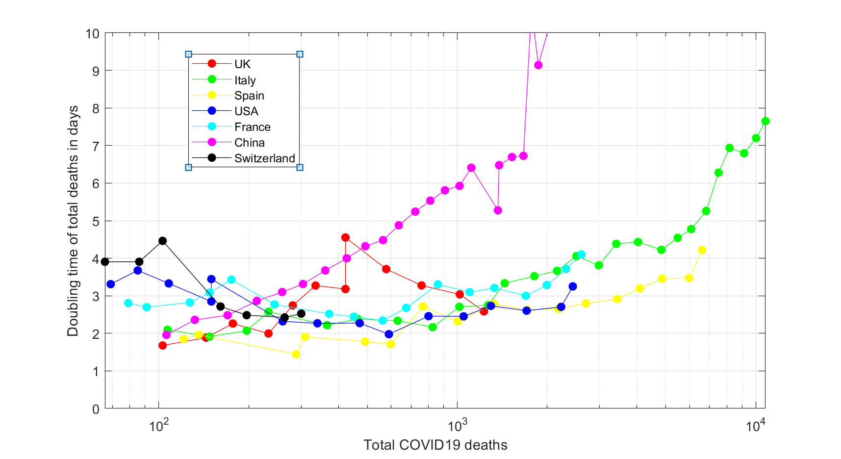
But, in a series of very helpful tweets, Julia Steinberger who is professor in social ecology and ecological economics at the University of Leeds presented the data in different way, shedding a different light on things. Her graph, shown below, plots the current doubling rate of new Coronavirus deaths against the total number of deaths. The doubling rate is the number of days it will take the number of deaths to double if the current rate of deaths is maintained. So, the higher the value, the better the epidemic is being contained.

Looked at this way:
- Improvements in Spain, Italy and especially China, where social restrictions have been in place longest, are evident.
- In the US, where the potential scale of the epidemic was initially underestimated, the doubling rate decreased for some time, and has only recently started to climb.
- In the UK, after initially climbing, the doubling rate has actually been declining, though the number of deaths in the last couple of days since the graph was produced have been lower, so the doubling rate has actually increased in recent days. Based on today’s numbers, the current doubling rate is around 4.9 days for the UK.
Updating to the most recent numbers for other countries as well, we find the current doubling rate for the US is around 4.6 days, for Spain it’s 5.4 days and for Italy it’s 9.53 days. In other words, it’s improving everywhere.
Admittedly, the picture is a bit more noisy than that of the previous post, partly because there are fewer deaths than cases, and also because these are daily values rather than weekly averages. But in any case the message is clear, especially once numbers are updated using the most recent data: social restrictions are working and numbers are improving, even if it’s difficult to see from the original plot. Re-interpreting the numbers in terms of doubling rates gives a much more optimistic picture of how the epidemic is being brought under control.
In summary: stay strong, stay at home. It does work.
It’s probably best to be a little cautious when interpreting the recent improvement in the UK numbers. Legally binding social restrictions have only been in place for a week, which is too short a time for effects to show up in the numbers of fatalities. So, whatever improvements there have been in numbers in the last couple of days is not due to government restrictions. It’s possible, however, that people’s behaviour patters had changed in advance of the formal government restrictions being announced, and this is what’s driving the improvement in numbers. It’s also possible, however, that the improvement is due to a combination of noise and changes in the way the data are being collated. We’ll get a clearer picture in the next few days once more data become available.
