Statistics is playing a fundamental role in supporting decision-makers by providing predictions of the Coronavirus epidemic spread and of the likely impact of possible courses of action they could take. Nothing is certain – from the transmission of the disease, to the way individuals will behave – which is why probability theory plays such an important role. We can’t be sure certain things will happen, but we can reasonably assign probabilities to them.
But at a more elementary level, clear presentation of data in both numerical and graphical form, is also important for understanding many characteristics of the epidemic. There are now various sources of well-presented information, and I thought it might be helpful to provide a list here of the best one’s I’ve found so far. If anyone has alternative sources, please send them to me or include them in the comments below and I’ll add them to the list
This page gives current counts of various types – including new cases – per country. It also includes simple graphics that track the epidemic evolution. There are links to each individual country, where a country-specific history of numbers is available, and also links to look at effects by age, sex and so on. Graphs and so on are updated daily, but the numbers themselves are updated every time a country releases new daily data.
This page is updated daily and gives very clear graphics of a number of aspects of the epidemic. It shows, for example, slight differences in the age distribution of mortalities for Italy and China and also compares the mortality and contagion rate for this epidemic against those of other epidemics and diseases.
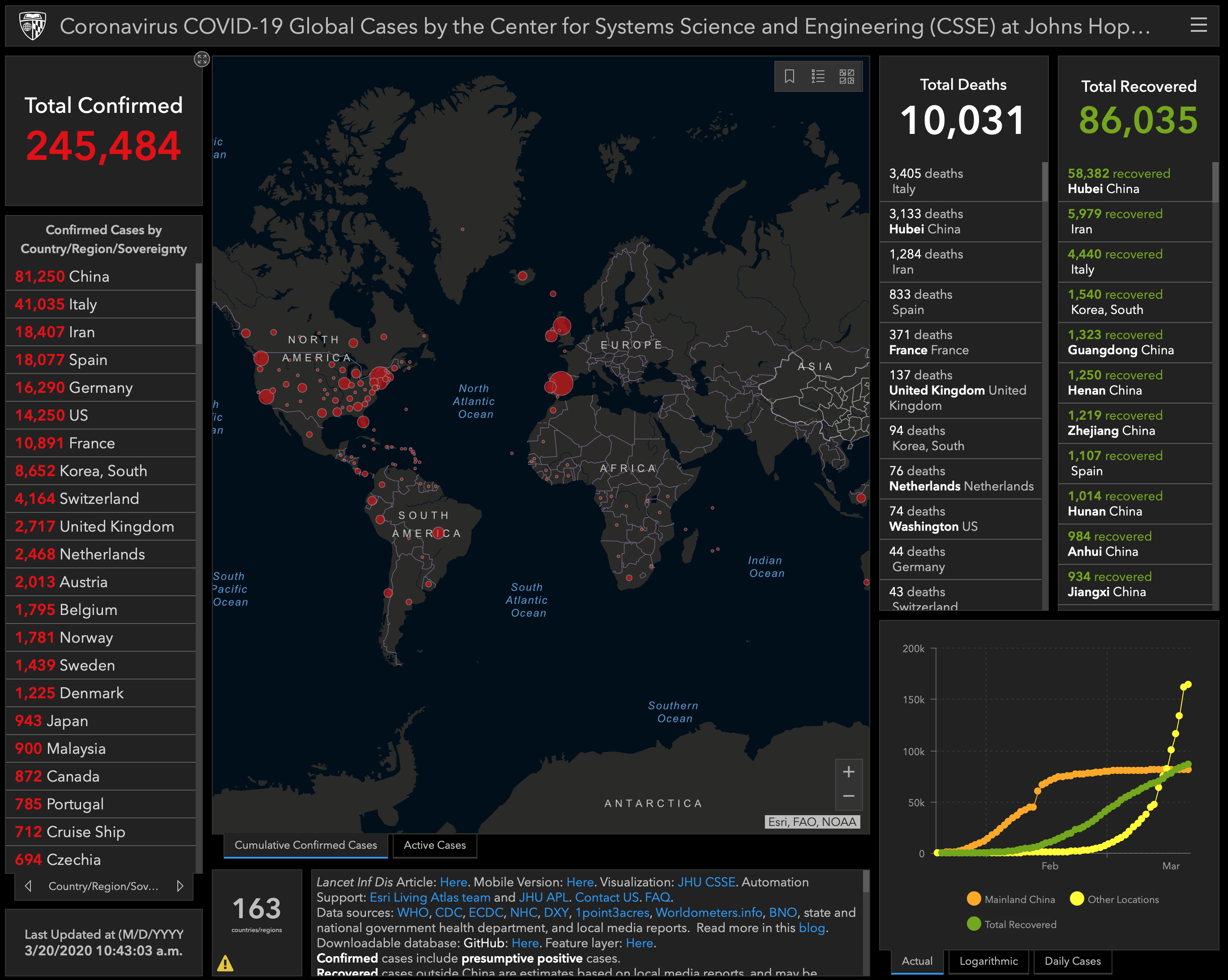
3. arcis.com
This is a dashboard giving numbers and a geo-graphical display of current cases. A more detailed UK-specific version of the dashboard is also hosted here.
This is a similar country-specific dashboard, but for Italy.
5. ft.com
The Financial Times gives this comparison of the epidemic growth across countries. It’s updated daily, though sometimes I can’t get past a paywall. Similar figures are available anyway in the dashboards above.
Like I say, please let me know of any other useful sources and I’ll add them to the list.
Update:
This page has updated graphs that allow you to compare the trajectory of the epidemic in specified countries over different timescales and on different scales.
