Last week, when discussing Kipchoge’s recent sub 2-hour marathon run, I showed the following figure which compares histograms of marathon race times in a large database of male and female runners.
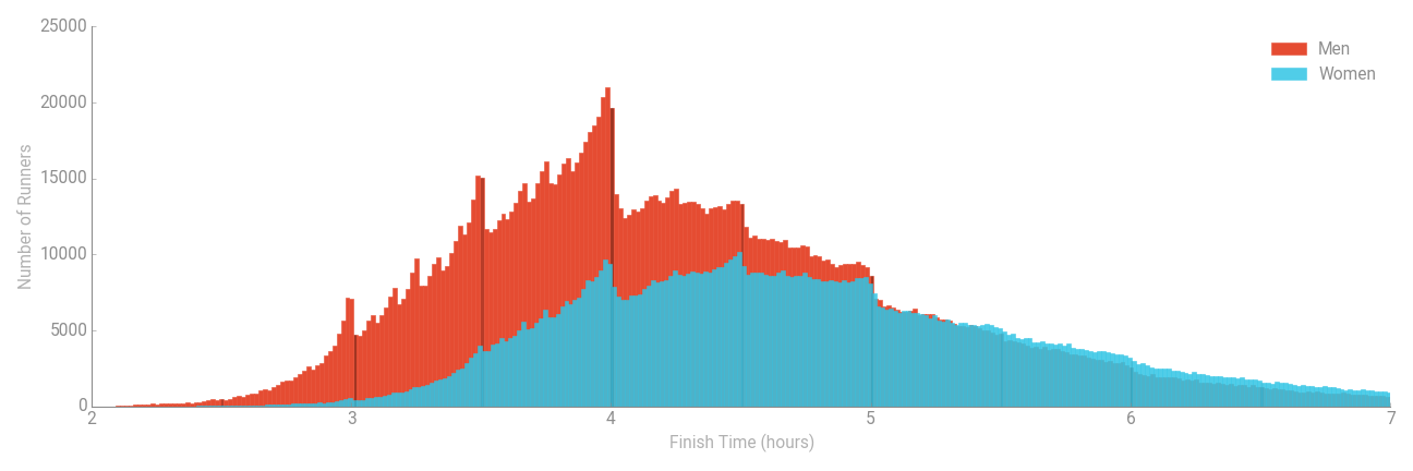
I mentioned then that I’d update the post to discuss the other unusual shape of the histograms. The point I intended to make concerns the irregularity of the graphs. In particular, there are many spikes, especially before the 3, 3.5 and 4 hour marks. Moreover, there is a very large drop in the histograms – most noticeably for men – after the 4 hour mark.
This type of behaviour is unusual in random processes:. frequency diagrams of this type, especially those based on human characteristics, are generally much smoother. Naturally, with any sample data, some degree of irregularity in frequency data is inevitable, but:
- These graphs are based on a very large sample of more than 3 million runners, so random variations are likely to be very small;
- Though irregular in shape, the timings of the irregularities are themselves regular.
So, what’s going on?
The irregularities are actually a consequence of the psychology of marathon runners attempting to achieve personal targets. For example, many ‘average’ runners will set a race time target of 4 hours. Then, either through a programmed training regime or sheer force of will on the day of the race, will push themselves to achieve this race time. Most likely not by much, but enough to be on the left side of the 4-hour mark.
The net effect of many runners behaving similarly is to cause a surge of race times just before the 4-hour mark and a dip thereafter. There’s a similar effect at 3 and 3.5 hours – albeit of a slightly smaller magnitude – and smaller effects still at what seem to be around 10 minute intervals. So, the spikes in the histograms are due to runners consciously adapting their running pace to meet self-set objectives which are typically at regular times like 3, 3.5, 4 hours and so on.
Thanks to those of you that wrote to me to explain this effect.
Actually though, since writing the original post, something else occurred to me about this figure, which is why I decided to write this separate post instead of just updating the original one. Take a look at the right hand side of the plot – perhaps from a finish time of around 5 hours onwards. The values of the histograms are pretty much the same for men and women in this region. This contrasts sharply with the left side of the diagram where there are many more men than women finishing the race in, say, less than 3 hours. So, does this mean that although at faster race times there are many more men than women, at slow race times there are just as many women as men?
Well, yes and no. In absolute terms, yes: there are pretty much the same number of men as women completing the race with a time of around 6 hours. But… this ignores the fact that there are actually many more men than women overall – one of the other graphics on the page from which I copied the histograms states that the male:female split in the database is 61.8% to 31.2%. So, although the absolute numbers of men race times is similar to that of women, the proportion of runners that represents is considerably lower compared to women.
Arguably, comparing histograms gives a misleading representation of the data. It makes it look as though men and women are equally likely to have a race time of around 6 hours. Though true, this is only because many more men than women run the marathon. The proportion of men completing the race with a time of around 6 hours is considerably smaller than that of women.
The same principle holds at all race times but is less of an issue when interpreting the graph. For example, the difference in proportions of men and women having a race time of around 4 hours is smaller than that of the actual frequencies in the histograms above, but it is still a big difference. It’s really where the absolute frequencies are similar that the picture above can be misleading.
In summary: there is a choice when drawing histograms of using absolute or relative frequencies. (Or counts and percentages). When looking at a single histogram it makes little difference – the shape of the histogram will be identical in both cases. When comparing two or more sets of results, histograms based on relative frequencies are generally easier to interpret. But in any case, when interpreting any statistical diagram, always look at the fine detail provided in the descriptions on the axes so as to be sure what you’re looking at.
Footnote:
Some general discussion and advice on drawing histograms can be found here.