Apologies for the terrible pun in the title.
When I used to teach Statistics I tried to emphasise to students that Statistics is as much an art as a science. Statisticians are generally trying to make sense of some aspect of the world, and they usually have just some noisy data with which to try to do it. Sure, there are algorithms and computer packages they can chuck data into and get simple answers out of. But usually those answers are meaningless unless the algorithm/package is properly tailored to the needs of the specific problem. And there are no rules as to how that is best done: it needs a good understanding of the problem itself, an awareness of the data that are available and the creative skill to be able to mesh those things with appropriate statistical tools. And these are skills that are closer to the mindset of an artist than of a scientist.
But anyway… I recently came across the following picture which turns the tables, and uses Statistics to make art. (Or to destroy art, depending on your point of view). You probably recognise the picture at the head of this post as Van Gogh’s Starry Night, which is displayed at MOMA in New York.
By contrast, the picture below is a statistical reinterpretation of the original version of Starry Night, created by photographer Mario Klingemann through a combination of data visualisation and statistical summarisation techniques .

As you can see, the original painting has been replaced by a collage of coloured circles, which are roughly the same colour as the original painting. But in closer detail, the circles have an interesting structure. Each is actually a pie chart whose slices in size and colour correspond the proportions of colours in that region of the original picture.
Yes, pointless, but kind of fun nonetheless. You can find more examples of Klingemann’s statistically distorted classical artworks here.
In similar vein… the diagram below, produced by artist Arthur Buxton, is actually a quiz. Each of the pie charts represents the proportions of the main colours in one of Van Gogh’s paintings. In other words, these pie charts represent the colour distributions over a whole Van Gogh painting, rather than just a small region of a picture, as in the painting above. The quiz is to identify which Van Gogh painting each of the pie charts refers to.
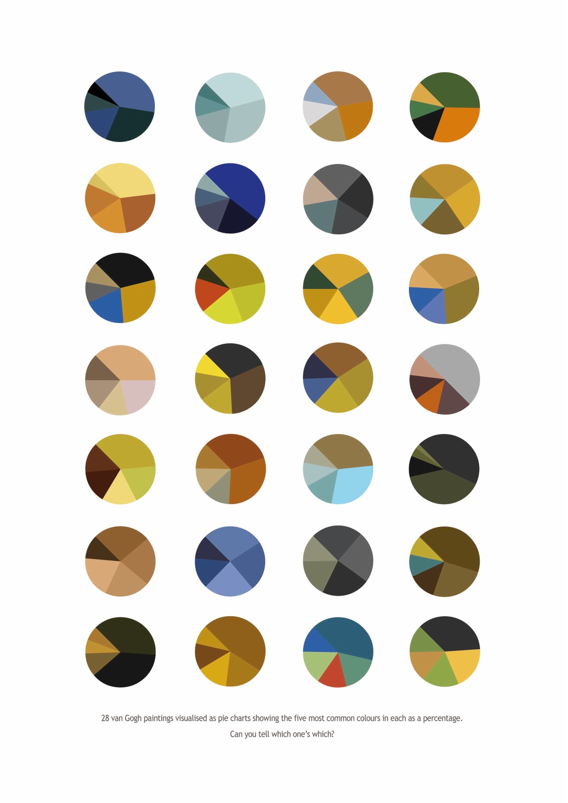
You can find a short description of Arthur Buxton’s process in developing this picture here.
There’s just a small snag: I haven’t been able to locate the answers. My guess is that the pie chart in column 2 of row 2 corresponds to Starry Night. And the one immediately to the left of that is from the Sunflower series. But that’s pretty much exhausted my knowledge of the works of Van Gogh. Let me know if you can identify any of the others and I’ll add them to a list below.
On the basis of experience with jigsaw puzzles – hey, we’re all on a learning curve and you never know when acquired knowledge will be useful – Nity reliably informs me that the third pie chart from the left on the bottom row will correspond to one of the paintings from Van Gogh’s series of Irises. Looking at this link which Nity gave me it seems entirely plausible.