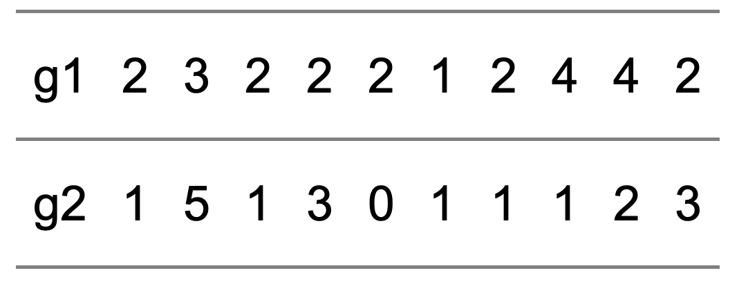
Look at the data in this table. There are 2 rows of data labelled g1 and g2. I won’t, for the moment, tell you where the data come from, except that the data are in pairs. So, each column of the table represents a pair of observations: (2, 1) is the first pair, (3, 5) is the second pair and so on. Just looking at the data, what would you conclude?
Scroll down once you’ve thought about this question.
|
|
|
|
|
|
|
|
|
|
|
|
|
|
|
|
|
|
|
Maybe you’re better at this stuff than me, but I wouldn’t find this an easy question to answer. Even though there are just 10 observations, and each observation contains just a pair of values, I find it difficult to simply look at the numbers and see any kind of pattern at all, either in the individual rows of numbers, or in any possible relationship between the two. And if it’s difficult in this situation, it’s bound to be much more difficult when there might be many thousands or millions of observations, and each observation might not be just a pair, but several – perhaps many – numbers.
So, not easy. But it’s a standard statistical requirement: taking a set of observations – in this case pairs – and trying to understand what they might convey about the process they come from. It’s really the beating heart of Statistics: trying to understand structure from data. Yet even with just 10 pairs of observations, the task isn’t straightforward.
To deal with this problem an important aspect of statistic analysis is the summarisation of data – reducing the information they contain to just a few salient features. Specifically, in this case, reducing the information that’s contained in the 10 pairs of observations to a smaller number of numbers – so-called statistics – that summarise the most relevant aspects of the information that the data contain. The most commonly-used statistics, as you probably know, are:
- The means: the average values of each of the g1 and g2 sets of values.
- The standard deviations: measures of spread around the means of each of the g1 and g2 sets of values.
- The correlation: a measure, on a scale of -1 to 1, of the tendency for the g1 and g2 values to be related to each other.
The mean is well-known. The standard deviation is a measure of how spread out a set of values are: the more dispersed the numbers, the greater the standard deviation. Correlation is maybe less well understood, but provides a measure of the extent to which 2 sets of variables are linked to one another (albeit in a linear sense).
So, rather than trying to identify patterns in a set of 10 pairs of numbers, we reduce the data to their main features:
- g1 mean = 2.4; g2 mean = 1.8
- g1 standard deviation = 0.97; g2 standard deviation = 1.48
- (g1,g2) correlation = 0.22
And from this we can start to build a picture of what the data tell us:
- The average value of g1 is rather greater – actually 0.6 greater – than the mean of g2, so there is a tendency for the g1 component of a pair to be bigger than the g2 component.
- The g2 values are more spread out than the g1 values.
- The positive value of correlation, albeit a value substantially lower than the maximum of 1, suggests that there is a tendency for the g1 and g2 components to be associated: bigger values of g1 tend to imply bigger values of g2.
So now let me tell you what the data are: they are the home and away scores, g1 and g2 respectively, in the latest round of games – matchday 28- in Serie A. So, actually, the summary values make quite good sense: the mean of g1 is greater than the mean of g2, which is consistent with a home advantage effect. And it’s generally accepted that home and away scores tend to be positively correlated. It’s maybe a little surprising that the standard deviation of away goals is greater than that of home goals, but with just 10 games this is very likely just to be a chance occurrence.
Which gives rise to a different issue: we’re unlikely to be interested in the patterns contained in the data from these particular 10 games. It’s much more likely we’re interested in what they might tell us about the pattern of results in a wider set of games – perhaps Serie A games from any arbitrary matchday.
But that’s a story for another post sometime. The point of this post is that we’re simply not programmed to look at large (or even quite small) datasets and be able to see any patterns or messages they might contain. Rather, we have to summarise data with just a few meaningful statistics in order to understand and compare them.
But actually, all of the above is just a precursor to what I actually wanted to say in this post. Luigi recently forwarded the following twitter post to the quant team on RocketChat. Press the start arrow to set off the animation.
The Datasaurus Dataset.
Here's a cautionary tale for everyone who analyzes data.
All 12 graphs (and all frames in between) each have the same mean and variance for both variables, and the same correlation coefficient.
So always visualize your data!https://t.co/EqLLbX2Btj pic.twitter.com/WlmBp1bTdL
— Martin Roberts (@TechSparx) March 6, 2019
As explained in the message, every single one of the images in this animation – including the passages from one of the main images to another – has exactly the same summary statistics. Thats to say, the mean and standard deviation of both the x- and y-values stay the same, as does the correlation between the two sets of values.
So what’s the moral here? Well, as we saw above, reduction of data to simple summary statistics is immensely helpful in getting a basic picture of the structure of data. But: it is a reduction nonetheless, and something is lost. All of the datasets in the the twitter animation have identical summary statistics, yet the data themselves are dramatically different from one image to another.
So, yes, follow my advice above and use summary statistics to understand data better. But be aware that a summary of data is just that, a summary, and infinitely many other datasets will have exactly the same summary statistics. If it’s important to you that your data look more like concentric ellipses than a dinosaur, you’d better not rely on means and standard deviations to tell you so.